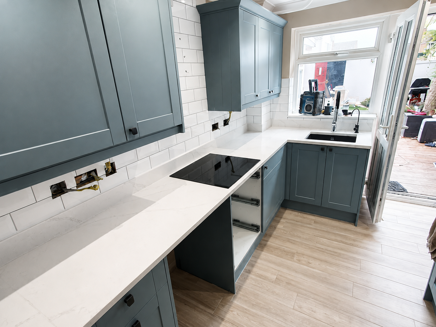

How to choose grout colour for a tiled room
Grout is a small part of the material list but a major part of the finished appearance. The colour can either soften the grid or make every joint a design feature.
Matching versus contrasting
A grout close to the tile colour tends to create a calmer, more continuous surface. A contrasting grout makes the layout and tile shape much more visible.
Neither approach is automatically better. The right choice depends on the tile, pattern and how prominent you want the joints to feel.
For anyone researching how to choose grout colour, the most useful approach is to look at the practical conditions behind the finish rather than treating the job as a single generic task. A grout close to the tile colour softens the grid and makes the tiled surface read more continuously. A contrasting grout emphasises the size and pattern of every tile, which can be effective with metro, geometric or decorative layouts. Small variations in joint width become more visible with strong contrast. Samples should be viewed beside the actual tile because printed charts and screens rarely reproduce grout colour accurately. This is where an experienced tiler can add value: not by using more technical language, but by checking the details that affect the finished surface and explaining the options before work is committed. For a homeowner, the practical test is simple: the proposed method should make sense for the exact room, the chosen tile and the way the area will be used, rather than relying on a one-size-fits-all rule.
Key points
- Light-on-light for a softer look
- Dark contrast to emphasise shape
- Mid-tone grout for practical balance
- Always test next to the real tile
Think about maintenance
Very light floor grout can show staining more quickly in busy areas, while very dark grout can highlight residue if it is not cleaned correctly after installation.
Choose a product suited to the location and follow the manufacturer's cleaning and sealing guidance where relevant.
The specification also needs to work as one system. That means the tile, substrate, preparation products and installation method should be considered together. Very pale grout can show dirt and staining more readily in busy floor areas, while very dark grout can show mineral deposits or cleaning residue. The right choice depends on use, cleaning routine and grout product as much as appearance. Epoxy and specialist grouts may offer different performance characteristics but also change installation and cleaning requirements. Sealers should only be used where appropriate for the specific grout. This is where an experienced tiler can add value: not by using more technical language, but by checking the details that affect the finished surface and explaining the options before work is committed. For a homeowner, the practical test is simple: the proposed method should make sense for the exact room, the chosen tile and the way the area will be used, rather than relying on a one-size-fits-all rule.
KB Tiling tip
View grout samples beside the tile in the actual room because lighting changes how both colours read.Silicone and movement joints
Flexible sealants at changes of plane should be chosen deliberately too. Coordinating silicone with grout can produce a more consistent finish around baths, showers and corners.
These joints serve a technical purpose as well as a visual one, so they should not simply be filled with rigid grout.
Good setting out and early decisions usually make the finished result easier to control, because problems are cheaper to solve on paper than after fixing has started. Silicone is usually used at movement joints and changes of plane, so its colour needs to sit comfortably beside the grout. Manufacturer colour names do not always match perfectly across grout and silicone ranges. Metal trims, sanitaryware and worktop colours can influence whether a warm, cool, pale or dark grout feels integrated. The whole palette should be considered together before the final choice. This is where an experienced tiler can add value: not by using more technical language, but by checking the details that affect the finished surface and explaining the options before work is committed. For a homeowner, the practical test is simple: the proposed method should make sense for the exact room, the chosen tile and the way the area will be used, rather than relying on a one-size-fits-all rule.
Common mistakes to avoid
Most avoidable problems begin with an assumption that was never checked. Common examples include choosing grout from a phone screen only, using a strong contrast without checking the tile layout, and selecting white grout for a high-traffic floor without considering maintenance. Each can look minor at the planning stage, yet any one of them can change the layout, the amount of preparation or the time needed to complete the work. The safer approach is to surface those decisions early and write them into the agreed scope. That gives the installer a clear standard to work to and gives the client something meaningful to compare when reviewing quotations.
Other mistakes are more likely to show up once work is under way: assuming silicone and grout with the same colour name will be identical, forgetting that grout can visually change the apparent tile colour, and making the decision after most of the installation is complete. These are not reasons to overcomplicate a straightforward tiling project. They are reminders that a durable finish depends on a chain of small decisions being made in the right order. If something important changes after the work starts, stop and reassess the effect on materials, preparation, finished levels and programme rather than forcing the original plan to fit a different situation.
Key points
- choosing grout from a phone screen only
- using a strong contrast without checking the tile layout
- selecting white grout for a high-traffic floor without considering maintenance
- assuming silicone and grout with the same colour name will be identical
- forgetting that grout can visually change the apparent tile colour
- making the decision after most of the installation is complete
A sensible way to plan the work
A sensible sequence keeps the project understandable. Start by place the actual tile in the room, then compare at least two or three physical grout samples. Once those basics are known, decide whether the joints should blend or stand out. That order matters because design choices are easier to judge when the physical condition of the room is already understood. It also reduces the chance of buying materials for a layout that later has to change. Before fixing starts, the client and tiler should be able to describe the intended finish, the preparation included and the main details that need particular attention.
From there, consider traffic, moisture and cleaning, check matching silicone and trim options, and finally agree the final colour before grouting begins. Keeping this sequence visible is especially useful on renovations where several trades are involved. Tiling often sits between preparation work and final fitting, so unclear responsibility can create delays. A short written scope, a few marked setting-out lines and photographs of concealed preparation can be more valuable than a long informal conversation because everyone can refer back to the same decisions.
Key points
- place the actual tile in the room
- compare at least two or three physical grout samples
- decide whether the joints should blend or stand out
- consider traffic, moisture and cleaning
- check matching silicone and trim options
- agree the final colour before grouting begins
Questions worth asking before work begins
A good pre-start conversation should answer practical questions rather than simply confirm a date. Ask: Do I want the tile pattern to be subtle or prominent? How will this grout look when wet or under warm lighting? Is the colour practical for the amount of traffic? Clear answers help separate what is included from what is assumed. They also make it easier to identify where another trade, supplier or product manufacturer needs to provide information before the tiler can proceed.
It is also worth asking: Is a matching silicone available? Does the grout require sealing or special maintenance? Will slight joint variation be obvious with this contrast? The aim is not to interrogate the installer; it is to make the scope transparent. A professional response should explain the reasoning in plain English and, where a product-specific decision matters, point back to the relevant manufacturer's instructions. That is a stronger basis for a project than relying on a vague promise that everything will be 'fine'.
Key points
- Do I want the tile pattern to be subtle or prominent?
- How will this grout look when wet or under warm lighting?
- Is the colour practical for the amount of traffic?
- Is a matching silicone available?
- Does the grout require sealing or special maintenance?
- Will slight joint variation be obvious with this contrast?
What this means for projects in Essex
In many essex renovations, neutral porcelain, stone-effect tiles and warm wood finishes are used together, so a mid-tone grout can often bridge the palette more naturally than pure white. For commercial and entrance floors, practical maintenance may deserve more weight than achieving the lightest possible joint.
A small test board is inexpensive compared with regrouting a room because the chosen tone looked different after drying. KB Tiling Essex works with domestic and commercial tiling projects across Chelmsford, Essex and surrounding areas, so local planning is less about inserting place names into a page and more about understanding the practical conditions of real properties and sites. If you are comparing options for how to choose grout colour, use local examples as context, but make the final decision around your own substrate, tile, room and specification.
Frequently asked questions about how to choose grout colour
Should grout be lighter or darker than the tile? Either can work. A similar tone creates a quieter surface, while a lighter or darker contrast makes the tile shape and pattern more obvious.
Does grout dry the same colour as it looks when mixed? Not necessarily. Curing, water content, lighting and the specific product can affect the final appearance, so use manufacturer samples where possible.
What grout colour is easiest to keep looking clean? Mid-tone colours often disguise everyday marks better than very pale or very dark extremes, but cleaning performance also depends on the grout product and room.
Should silicone match the grout? Usually a close match creates a cleaner finish, but exact matches are not guaranteed across product ranges.
Can grout colour make a room look bigger? A grout close to the tile colour can reduce visual segmentation and create a more continuous appearance, although room size is influenced by many other design choices.
Final planning checklist
Before committing to the work, review the project in one pass. Confirm the substrate, tile specification, layout, preparation, installation materials, grout or joint details, access and programme. If the project involves grout colour ideas, matching grout or contrasting grout, make sure those choices are reflected in the written scope rather than left as verbal assumptions. Keep product names and batch information where relevant, retain a small project record, and store sensible spare material after completion. These simple habits make future maintenance or local repairs much easier.
SEO searches often reduce a tiling decision to one phrase, but a real installation is always more specific. Someone searching for how to choose grout colour may be asking about cost, suitability, preparation, appearance or long-term maintenance at the same time. The best answer is therefore the one that connects those questions instead of repeating a keyword. Use this guide as a framework, then confirm the exact method for your room with the installer and the manufacturers of the products being used.
Final word